Market360 · Design System

UIKit

The Pharma 360 design system — tokens & components. Every swatch, scale and primitive below is pulled live from the same code that drives the /dols surface.

01

Color

Dark is the approved baseline — deep navy canvas, one cyan/teal primary family, a small categorical accent set. Light is its counterpart, same roles with darkened accents. Rule in both: at most four dominant accents per screen; one accent owns one entity (card / KPI). Flip the switch above — every swatch below repaints live.

Surfaces & background
Background#0A0B16--v2-bgPage canvas (de-blued navy)
Panel#10111B--v2-panelBase panel surface
Panel 2#161824--v2-panel-2Avatars, menus, raised fills
Panel 3#0D0E17--v2-panel-3Recessed panel
Raise#1A1C28--v2-raiseHover / elevated tiles
Inset#0B0C14--v2-insetSunken wells
Primary — cyan / teal
Teal#2DD4BF--v2-tealPrimary action · Mid Tier · active states
Teal bright#34E7CE--v2-teal-brightBrighter teal accent
Cyan#22D3EE--v2-cyanGradient partner · TikTok glyph
Categorical accents
Violet#A78BFA--v2-violetTertiary · Type tags · gradient end
Magenta#F25CB0--v2-magentaNotifications · AI suggest · hot metrics
Magenta soft#F472B6--v2-magenta-softSofter magenta tint
Orange#FB923C--v2-orangeMicro tier · warm accent · warnings
Amber#F5B544--v2-amberRising tier · mid-range engagement
Rose#FB7185--v2-roseDown deltas · low engagement
Blue#60A5FA--v2-blueElite tier (cool end of ramp)
Green#4ADE80--v2-greenType / Group meta chips
Text & lines
Text#EAEEF8--v2-textPrimary text
Text dim#93A0BC--v2-text-dimSecondary text · idle icons
Text mute#8993AD--v2-text-muteLabels (AA 5.5:1 on bg)
Text faint#7C869D--v2-text-faintTallies / hints (AA 4.6:1)
Linergba(150,170,210,.10)--v2-lineDefault 1px divider
Line strongrgba(160,180,220,.18)--v2-line-strongEmphasised border / hover
02

Surfaces

Three levels, no resting shadows. The page ground is tinted; a card is a white plane on it with a hairline; a block that is itself a thing inside a card — a list of rows, a chart, a tile — sits one step down on --panel-3. Hover lifts a card with --shadow-card; that is a state, not a look. Agreed 2026-09-10 after the grey-on-grey cards and then the shadow under every white one — both were one level trying to do the work of three. Dark keeps its own ladder (--panel → --panel-3); flip the switch above to compare.

0 · ground · --bg
1 · card · --raise + --line
2 · nested block · --panel-3rows · tiles · chart wells
03

Spacing

Strict 8-px grid: 2 / 4 / 8 / 12 / 16 / 24 / 32 / 40 / 48 / 56 / 64. 12 is the one allowed half-step. 20 / 28 / 36 / 44 are banned.

2px
4px
8px
12px · half-step
16px
24px
32px
40px
48px
56px
64px
20px · banned
28px · banned
36px · banned
44px · banned
04

Type

One typeface — Inter — across the whole product; hierarchy comes from weight and size, not pairing. Round sizes only, floor 11px. Numbers carry tabular-nums.

36px · 700H1 / hero — DOL name, hero title
Digital opinion leaders, decoded
28px · 700Big numbers — KPI value, total audience
Digital opinion leaders, decoded
22px · 700Medium numbers · card name
Digital opinion leaders, decoded
17px · 600Sub-heading — section & block titles
Digital opinion leaders, decoded
14px · 400Body — bio, names, row values, buttons
Digital opinion leaders, decoded
12px · 400Secondary — handle, captions, deltas, counts
Digital opinion leaders, decoded
11px · 600Caps — eyebrows, KPI labels, tags
Digital opinion leaders, decoded
Weights in use
Aa
Regular · 400
Aa
Medium · 500
Aa
Semibold · 600
Aa
Bold · 700
05

Radius & Motion

Radii scale from 6px (chips) to fully round (pills, avatars). Motion is restrained: one standard easing, short durations, hover never brighter than active.

Radius
xs6px
sm9px
md13px
lg18px
xl22px
pillfull
Motion — easings & durations
Standard easecubic-bezier(0.16, 1, 0.3, 1)--v2-ease — every hover, accordion, layout transition
Hover / color200ms · easeicon-buttons, nav items, chips, opt rows
Card lift / layout300–350ms · var(--ease)card transform+border+shadow, filter-body grid-rows, hero fold
Drawer slide320ms · var(--ease)≤1024 filter drawer translateX + backdrop fade
AI-FAB pop550ms · cubic-bezier(0.2, 0.8, 0.2, 1)assistant tile entrance (the “chuk”)
AI-FAB stroke-draw5.2s linear · 0.6s delay · bothlooping ring/dot draw — delay+both kills first-cycle load jank
06

Components

The real primitives from components/v2, rendered with live mock data. Interaction states (hover / selected / active) are frozen statically so the whole set is visible at once.

Tag / chipThree roles — tier (size-ramp + graduated star), specialty (neutral sphere), type+group (green meta key/value). Pill, uppercase-ish, 11px.
Tier ramp — color + star graduate with audience size
MicroRisingMid TierMacroElite
Specialty (neutral) · Type + Group (meta)
Bariatric SurgeonEndocrinologistTypePublicGroupA
KPI tileAccent-outlined stat tile: icon + delta up top, big tabular numeral pinned to the bottom, dual corner glows.
+12
234
Total DOLs
+0.42%
3.84%
Avg Engagement
Filter chipChannel selector chip in the filter sidebar. Pill with leading glyph; default → hover → active (teal tint + glow).
Default · Active (.on)
Icon buttonProject standard — 40×40 button + 20px Tabler glyph, inline-flex centred. Idle / hover (white/8 band) / with notification dot.
Idle
Hover
Dot
Channel selectorRow of social tabs (icon-button standard). Active tab gets the channel-color underline + glow; click to switch (live).
Toolbar buttonsFilters toggle (with active-count badge), result count, and the split-menu sort (label opens key menu; trailing button flips direction).
234Influencers
Social iconsTabler brand glyphs, monochrome via currentColor. Channel brand colors live in channelMeta for active/underline accents.
Facebook
Instagram
X
LinkedIn
YouTube
TikTok
Threads
SparklineInline area+line+endpoint micro-chart for metric trends. Color-tinted gradient fill; stable gradient id seed (SSR-safe).
Track (bar in a lane)A full-width lane with a filled portion. The lane is what makes a column of bars readable — without it you can compare two values but not see how large either one is. 8px in rank rows, 16px where the fill prints its own value (11px type is the floor). Both come from the same mixin, so the DOL rank lists, the NPS aspect map and this catalogue cannot drift apart.
#diabetes67
#glp154
#weightloss37
16px, valued38%
Loader / spinner (active state)Looping 3-arc spinner (dots-pinwheel) — the active / loading indicator.
AI assistantThe bottom-right assistant button — dots orbit, then morph into the sparkles icon.
Empty stateNo-results panel — dashed frame, glyph mark, title + helper line, clear-filters CTA.

No influencers match

Try loosening a filter or clearing your search to widen the result set.

Cards — influencerThe main object — avatar+ring, identity, tier/specialty/meta tags, bio, live channel tabs, 4-metric strip with sparklines + deltas. Default and frozen-hover (lift + tier border + glow).
Leila Karimi

Leila Karimi

@leila.weighed · Abu Dhabi, UAE
ElitePatient AdvocateTypePublicGroupA

Bariatric patient advocate and community builder. Documents the surgical journey and rallies a highly engaged support network.

Followers
921K
Posts
1.8K
4%
Comments
74.3K
3%
Engagement
8.4%
Default
Akshay Jain

Akshay Jain

@drakshayjain · Surrey, BC, Canada
Mid TierEndocrinologistTypePublicGroupA

Triple board-certified endocrinologist. Covers GLP-1 therapeutics, metabolic medicine, and patient-friendly diabetes education.

Followers
42.8K
Posts
720
5%
Comments
2.8K
4%
Engagement
4.76%
Hover (frozen)
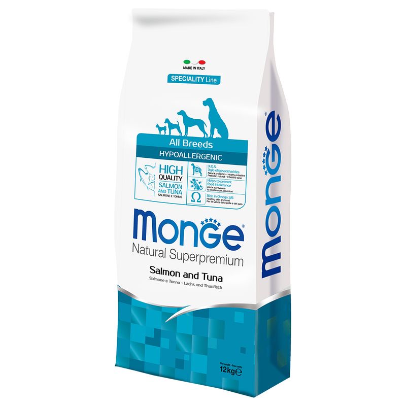
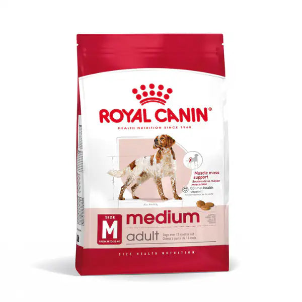
Cards — productThe image-first card of the Products board: pack photo on a white 4:3 plate, brand micro-label, name, retailer reference, price with its movement, and the Mentions · Retailers · Variants plate — the influencer card's plate, cell for cell.
Monge

Monge Natural Superpremium All Breeds Adult Hypoallergenic with Salmon and Tuna

SKU 9001233 · 12 kg
€41.995.6%
Arcaplanet · 30 days
Market range over 30 days: the shaded area is the cheapest to the dearest single pack across retailers each day; the gold line is your own price inside it.
Mentions
14
Retailers
5
Variants
4
Default
Normalization required
Royal Canin

Royal Canin Medium Adult

SKU 9001887 · 15 kg
€86.906.6%
Arcaplanet · 30 days
Market range over 30 days: the shaded area is the cheapest to the dearest single pack across retailers each day; the gold line is your own price inside it.
Mentions
38
Retailers
5
Variants
3
Hover (frozen)
Multipack ExplorerRetailers down, multipack variants across, one price per intersection. Gold is the client and the only role colour; a discount rides the price as a superscript; an empty cell with history says when the variant was last on the shelf. Includes the 30-day variants-over-time chart.
Period barThe full-width strip between a product hero and its modules — every figure below it is a one-day snapshot of a shelf that changes daily, and this is what picks the day. Today · Yesterday · a date field.
Price bandShaded area = cheapest to dearest single pack across retailers, per day; gold line = the client's own price. Card size (48px) and page size (150px). Single packs only — a ×18 unit price is not comparable to a ×1.
Market range over 30 days: the shaded area is the cheapest to the dearest single pack across retailers each day; the gold line is your own price inside it.
Card · 48px
Market range over 30 days: the shaded area is the cheapest to the dearest single pack across retailers each day; the gold line is your own price inside it.
Product page · 150px
Compare — productsSelection bar as it appears once a card is ticked, and the side-by-side modal. Rows: your price, cheapest on market, 30-day move, retailers, variants, mentions — 'best' per row (lower wins for prices, higher for coverage).
2 selected
Press Compare to open the live modal
Internal menus — Vertical and LayoutsThe two controls behind the Ctrl curtain: the dropdown of page types (Layouts · Preview · Design system) and the vertical label. Rows are identical in every state; the active one gets a fill, an inset hairline and a check. The Layouts panel slides left when it would cross the viewport edge. In the header both are absent until Control is tapped and go away on the next tap; the catalogue shows them anyway, because the curtain is a behaviour of the header, not of these components.
KPI heroPage-top summary band — eyebrow + gradient headline + four KPI tiles, with a −/+ minimise toggle. Full live composite.
Digital Opinion Leaders

The pulse of pharma voices,
decoded in real time.

+12
234
Total DOLs
+0.42%
3.84%
Avg Engagement
+1.8M
12.4M
Reach (30d)
+3
18
Active Campaigns
ToolbarFilters button + result count + search (live) + split-menu sort. The complete control strip from the DOLs page.
234Influencers
Sidebar sectionFilter panel — collapsible sections, checkbox option rows with live tallies, count badges, channel chip grid. Live (toggle options).
07

Charts

Every chart type the product draws, from components/v2/charts and the boards. One hover for all of them — the .chart-tip panel. Before drawing a new chart, use one of these; a new one is added here in the same change.

Stacked columns — StackedColumnsOne column per period, stacked by series, bottom series first. Even axis step, hairline between segments, rounded cap on top, max 24px columns; the hovered tick lifts into a pill, the rule cursor and .chart-tip list the column. Used by: Multipack variants dynamics, City 360 reviews, mentions, promo.
  • 1 star
  • 2 stars
  • 3 stars
  • 4 stars
  • 5 stars
Heat grid — HeatGridRows × columns on one teal scale run to the largest cell, «Fewer → More» and «Full cell = N» in the corner, an optional totals row, quieter sub-rows (last year), marked columns (scheduled). Hover: .chart-tip follows the cell. Used by: Market map, City 360 demand and flights.
Full cell = 4,400 searchesFewerMore
MAY 2026
JUN 2026
JUL 2026
AUG 2026
SEP 2026
OCT 2026scheduled
hotel lugano
2,900
3,600
4,400
4,400
3,600
2,900
things to do in lugano
1,900
2,400
3,600
3,600
2,400
1,600
lugano boat tour
880
1,600
2,400
2,400
1,300
590
lugano christmas market
90
70
70
110
320
880
Map — ChoroplethAreas of a place coloured by one measure, on the heat grid's scale (one teal, the full value in the corner, a 6% floor so every area reads as land); the panel's hairline between areas; water in a quiet cyan under them; .chart-tip on hover; the key above the map, right (the heat grid's legend bar); the geometry's credit under the map. `bleed` runs a map cut to its frame out to the card's left, right and bottom edges, so the cut edges are the card's. New because no layout had a map. Used by: City 360 → City map (bleed).
NEW · City 360
Full = 9,300 residentsFewerMore

Map data © OpenStreetMap contributors · demo figures

Heat strip — NeedTrendsOne row per topic, one cell per day, one scale for the block anchored at its floor and peak; the count and the delta chip at the end. Hover: .chart-tip over the cell. Used by: Nutritional needs trends.
Hypo Formula82429.5%
Monoprotein formula35419.4%
Skin and hair support42112.1%
10 AUG20 AUG30 AUG08 SEP
NPS columns — NpsChartOne column per brand: promoters, neutrals and detractors on the NPS band tokens, the index above, the previous period beside it. The product's colour code for «happy · so-so · unhappy» — City 360's stars use the same bands. Used by: NPS report.
NPS indexPromoters − Detractors
  • Promoters9–10
  • Neutrals7–8
  • Detractors0–6
Q3 2026Q2 2026
PrivatBank
+11▲2
41%
29%
30%
39%
31%
30%
N = 10,249
Monobank
+32▲4
53%
26%
21%
50%
28%
22%
N = 5,776
PUMB
+4▲2
37%
30%
33%
35%
32%
33%
N = 2,639
Oschadbank
-4▼3
32%
32%
36%
34%
31%
35%
N = 3,369
A-Bank
0▲6
35%
30%
35%
31%
32%
37%
N = 1,527
Aspect map — AspectMapBrands × aspects, the promoter or detractor level per cell, now against the previous period. Used by: NPS report.
Promoter levelQ3 2026 / Q2 2026Lane 0–50%
PrivatBank
Monobank
PUMB
Oschadbank
Branch:
Staff Assistance
33%
38%
35%
Digital Banking:
Ease of Use
27%
46%
18%
Support:
Assistance
41%
26%
Card:
Delivery and Pickup
19%
22%
15%
Support:
Resolution
17%
28%
Branch:
Service
24%
21%
Ranked rows — RankRowsOrdinal, label, value, delta chip, and a full-width lane under each row so ten rows read as one column of lengths. Used by: Products & features facets, City 360 communities and ads.

Communities

4 of 184
  1. 01Vivere a Lugano24 800
  2. 02Expats in Ticino20 300
  3. 03Lugano Foodies15 700
  4. 04Ticino Hiking12 700
DistributionAn ordinal or numeric facet drawn in its own order — never as a ranking — with the weighted median under the axis when the facet is numeric. Used by: Products & features.
6
7
8
9
10
11
12
13
14
15
16
Median 11 mm6 mm → 16 mm
Split · LeadSplit: values that partition the population, with the remainder named. Lead: one value that is the finding, then the tail. Used by: Products & features.
  • Automatic67.0%1 956126
  • Quartz20.7%60558
  • Manual9.7%28249
  • Solar Quartz2.5%7420
  • Smart0.1%41
Stainless Steel1 782 of 2 921 models190
  • Titanium271
  • Rose Gold205
  • White Gold140
  • Ceramic135
  • Yellow Gold107
  • Bio-Sourced100
  • Platinum54
  • Red Gold47
  • Carbon37
PaletteA colour facet drawn as the colours themselves, with their share. Used by: Products & features (dials).
  • Blue625 21%77
  • Black505 17%51
  • White310 11%21
  • Silver258 9%28
  • Green236 8%23
  • Grey182 6%42
  • Skeleton143 5%25
  • Multi-Color126 4%8
  • Beige106 4%14
  • Brown94 3%3
  • Champagne75 3%5
  • Salmon70 2%11
Bar lists — RankList · BarListThe Influencer page's ranked lists: a clickable one that opens the mentions drawer (hashtags, key topics) and a static one (comments insights, interest profile). Same lane as the track.
  • 58
  • 55
  • 53
  • 48
  • 22
  • Fitness12
  • Lifestyle12
  • Parenting10
  • Health & Wellness2
  • Nutrition2
SparklineThe inline trend: area, line, endpoint. No axis, no hover — a shape beside a number, never a chart to read values from.
08

Blocks

The cards and plates every layout is built from. A stage marked NEW was introduced for City 360 on 2026-10-28 because nothing in the kit covered it — it stays flagged until a second page adopts it.

Facet card — FacetCard on .fx-boardThe board card: 17px title, the 12px census on the right, the plate; spans 4 / 6 / 12 of a 12-column board, 16 apart. Used by: Products & features, City 360.

Searches

8 queries × 6 months

Any block of a board sits in one of these.

Advertisers

8 · 716 ads

Charts inside take the card's frame.

Metric plate — .metrics / MetricThe card's metric row: micro-label, figure, delta chip, optional sparkline. Used by: influencer card, product card, City 360 gov sites.
Followers
12.4K
4.1%
Posts
164
Topic tile — TopicTileIcon, label, mention-trend sparkline and a count that opens the mentions drawer. Used by: Influencer page (diseases, medicaments).
Brand views — BrandViewsAn in-block switch (Views · Likes · Comments — the product's segmented control) over brand logo tiles with a value and a relative bar. Used by: Influencer page; the switch also by City 360 reviews.
  • 62.8K
    avg. views
  • 36.8K
    avg. views
  • 30.7K
    avg. views
  • 29.1K
    avg. views
  • 28.3K
    avg. views
NPS hero — NpsHeroThe report's band: the headline, the KPI tiles for the chosen brands. Used by: NPS report.
Net Promoter Score

Who is recommended,
and what for.

All channels
22K
Reviews read
+1 vs Q2 2026
+11
Average NPS
since last period
+4
Riser · Monobank
since last period
-3
Drop · Oschadbank
Logos — BrandLogoTile · BrandMark · SocialLogoA brand in a white tile, a brand monogram, a social network glyph.
Tab intro — TabIntroWhat a tab is for, before anything on it is read: the tab's name as an eyebrow, the question it answers in the client's voice (display face, 28), the line of what is on it, and «This week» when something moved. Every tab of City 360 opens with one.
NEW · City 360
Communities

What are residents complaining about right now?

Local groups and forums, grouped by topic and neighbourhood.

Entity header — cityBuilt from the Influencer page's hero pieces: the .dd-profile plate with the round mark, the name, the .tag chips and the bio; the social pages are its «By network» card. New is only the two-column arrangement (.ct-hero).
NEW · City 360

Lugano

SwitzerlandTicino

A city page in Country360 — logo, description, social pages, then the tabs.

Social pages
  • Facebook48.2K+4.0%
Tab strip — .ct-tabsPage-level tabs that switch the topic, as on the Watch360 brand page: text tabs, the active one on a raised ground with a teal underline, arrows / Home / End move along it (WAI-ARIA tabs), the period control on the right. New because no layout had text tabs.
NEW · City 360
Data table — .ct-tableA plain table when the data is a list of objects with several measures: 11px uppercase heads, 14px cells, numbers right-aligned and tabular, the delta chip in the last column. New because no layout had one.
NEW · City 360
ObjectRatingReviews
MASI Lugano4.61,284
LAC Lugano Arte e Cultura4.52,031
09

Overlays

One recipe per kind of thing that opens over the page. Charts never bring their own tooltip — they use .chart-tip, following the cursor.

Chart tooltip — .chart-tipThe one hover panel: the period in an 11px uppercase line, a row per series (swatch · name · value), an optional foot. Follows the cursor; never pinned to a corner.

08 OCT

  • 5 stars10
  • 1 star3

26 reviews · average 3.7

Card menu — .card-menuThe kebab's menu on a card and in the sticky bar: icon + label rows.
Mentions drawer — MentionsDrawerThe side drawer behind a topic or a hashtag: the mentions themselves, with their source and engagement.
Compare modal — CompareModalTwo to four influencers side by side; the product version is in Components → Compare.
Toast — .v2-toastA one-line confirmation at the foot of the screen; it leaves by itself.